User Cohorts on the StackExchange Network
Here’s a quick post on something I’ve been playing with recently. For fun I was looking at the data from the StackExchange API and noticed that it provides user ages, assuming a user has provided their birthdate to StackExchange.
So, for fun, I decided I’d look at the Mathematica user-age distribution. Here’s how I pulled down the data:
$so = ServiceConnect["StackExchange"];
mseUsers =
   $so["QueryIterate",
     "Request" -> "Users",
     "site" -> "mathematica"
     ];
I’ve cached that data in the cloud, so for those who are interested in looking at it, this will suffice:
mseUsers = CloudImport["user:b3m2a1/mse_users_list.mx"];
We’ll then want a function for extracting age data and we’ll include an optional weighting parameter, too, so we can weight by reputation:
userAgeData[ds_, weighting_: None] :=
   Lookup[
      Merge[
        Normal@
      ds[Select[#["age"] > 0 &]][All, {"reputation", "age"}],
        Flatten
        ],
      {"age", "reputation"}
      ] //
    If[weighting === None,
       #[[1]],
       WeightedData @@ ReplacePart[#, 2 -> Map[weighting, #[[2]]]]
       ] &;
Then creating a SmoothHistogram of this data:
SmoothHistogram[userAgeData[mseUsers],
  PlotRange -> { {10, 100}, All},
  GridLines -> {Range[10, 100, 5], None}
  ]

(*Out:*)
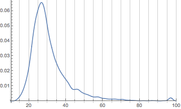
We notice we have a few interesting features:
-
An incredibly strong peak around age 27
-
A bump around age 47
-
A bump around age 97
The last of those is likely coming from people supplying the maximum possible age to StackExchange and the first is probably reflective of the fact that graduate students tend to be the core users of Mathematica (and also that StackExchange skews young in general).
The second could have many factors, but my guess—and note it is really just a guess—since I just mentioned graduate students, is that there’s a group of professors who use the site. But it could be reflective of many things and any suggestions would be of interest to me.
Now let’s look at this with some weighting provided for user reputation.
SmoothHistogram[userAgeData[mseUsers, Identity],
  PlotRange -> { {10, 100}, All},
  GridLines -> {Range[10, 100, 5], None}
  ]

(*Out:*)
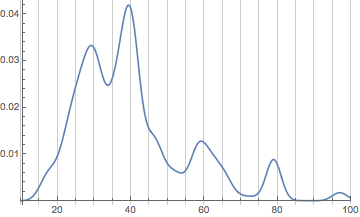
What we’re seeing now is the effect of small groups of core users. There’s:
-
A group of retirees up around 80
-
A group of mostly WRI employees around 60
-
A group of former and current scientists (mostly physicists) around 40, many of whom work for WRI
-
A collection of people at the expected peak around 29
(note that most of this isn’t possible to get from the graph, I just checked which users corresponded to which groups)
Now let’s change the weighting so these core groups aren’t as dominant;
SmoothHistogram[userAgeData[mseUsers, Power[N[#], .8] &],
  PlotRange -> { {10, 100}, All},
  GridLines -> {Range[10, 100, 5], None}
  ]

(*Out:*)
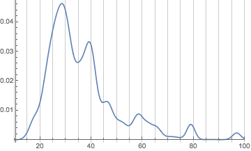
We can see already that things are shifting back younger. Let’s make a little animation of the shift:
ListAnimate[
  Table[
    With[{shift = shift},
      SmoothHistogram[userAgeData[mseUsers, Power[N[#], shift] &],
        PlotRange -> { {10, 100}, All},
        GridLines -> {Range[10, 100, 5], None}
        ]
      ],
    {shift, 1, 0, -.1}
    ]
  ]

(*Out:*)
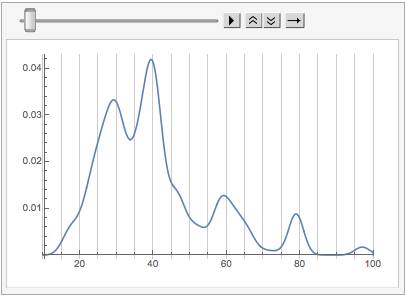
What we can see in this is that the core Mathematica StackExchange user tends to be older (in many cases considerably) than the average Mathematica StackExchange user.
Cross Site Comparisons
Now let’s see how Mathematica compares to other sites on the StackExchange network. First we’ll create a function that will pull down a user cohort from a different site of about the same size at the Mathematica user cohort:
userCohort[site_, n_: 35000] :=
  $so["QueryIterate",
    "Request" -> "Users",
    "site" -> site,
    "MaxIterations" -> Ceiling[n/100]
    ]
Now, let’s look at math and the main site. First pull the data:
mathUsers = userCohort["math"];
soUsers = userCohort["stackoverflow"];
And make the same sort of histogram:
SmoothHistogram[
  userAgeData /@
    <|

   "Mathematica StackExchange" -> mseUsers,
      "Math StackExchange" -> mathUsers,
      "StackOverflow" -> soUsers
      |>,
  PlotRange -> { {10, 100}, All},
  GridLines -> {Range[10, 100, 5], None}
  ]

(*Out:*)
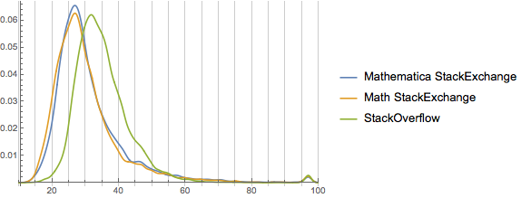
And interestingly we see that the profile of the math site is very similar to the Mathematica site except for a few perhaps skewing a bit younger (no blips around 40 and 45, more probability down towards 18 and 20). StackOverflow, however, is very different. We’ll expand this to look at many more sites and see if we can extract anything from that.
First we’ll make the same sort of reputation-weighted plot as before, though:
SmoothHistogram[
  userAgeData[#, Identity] & /@
    <|

   "Mathematica StackExchange" -> mseUsers,
      "Math StackExchange" -> mathUsers,
      "StackOverflow" -> soUsers
      |>,
  PlotRange -> { {10, 100}, All},
  GridLines -> {Range[10, 100, 5], None}
  ]

(*Out:*)
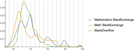
We can see from this that only Mathematica so skewed by the effects of small groups of users. This may well be because of the differences in population size, though. We only partially sampled from StackOverflow and math, while we had the entire user-cohort for Mathematica.
Let’s check out this hypothesis:
ListLinePlot[
  Normal@#[All, "reputation"] & /@
    <|

   "Mathematica StackExchange" -> mseUsers,
      "Math StackExchange" -> mathUsers,
      "StackOverflow" -> soUsers
      |>
  ]

(*Out:*)
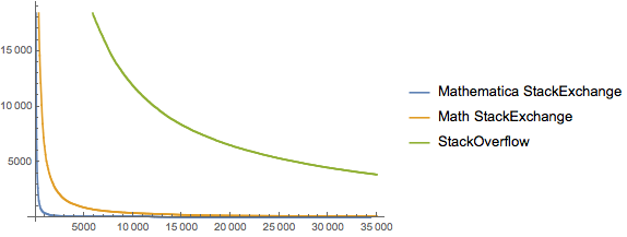
We notice that there’s a lot less skew in the other two communities, particularly StackOverflow. Let’s focus on it. Considering that we may still have sampling issues, let’s check out the highest-rep users of the site:
TakeLargest[Normal@soUsers[All, "reputation"], 36] //
 Newlineate[#, 4] &

(*Out:*)

{
  973816, 754771, 751311, 714950,
  710297, 689050, 671794, 599982,
  585842, 585344, 575101, 565940,
  553757, 548520, 536940, 528742,
  511144, 504964, 504356, 502389,
  500592, 494351, 493484, 477360,
  471503, 466358, 461402, 457448,
  450181, 449332, 445476, 444598,
  443842, 440660, 436769, 431215
  }
And by doing a visual comparison with this: https://stackoverflow.com/users?tab=Reputation&filter=all . We see that we have in fact hit the entire group. This suggests (but in no way proves) that our issue isn’t sampling after all, but rather something about the communities themselves.
First off, StackOverflow is simply much larger than the Mathematica StackExchange. That alone decreases the effect of any high-reputation user. But another possibility is in how one gets reputation.
The best way to get reputation is to answer questions that will be useful to many users, so naturally the more types of questions you can answer, the faster your reputation will grow. On the Mathematica site, there is only one core topic, so a given user can answer proportionately more types of questions than on the math of StackOverflow. But to confirm this we’ll again want to look at more sites.
Extended Cross-Site Comparison
We’ll add on chemistry, physics, server-fault (the sysadmin site), and software engineering. Since Mathematica is both programming language as well as computational tool, these sites may have similar populations. Finally we’ll also add on TeX because that’s got the same type of specific focus that Mathematica does.
chemUsers = userCohort["chemistry"];
physUsers = userCohort["physics"];
servUsers = userCohort["serverfault"];
sweUsers = userCohort["softwareengineering"];
texUsers = userCohort["tex"];
And the histogram:
SmoothHistogram[
  userAgeData /@
    <|

   "Mathematica StackExchange" -> mseUsers,
      "Math StackExchange" -> mathUsers,
      "Chemistry StackExchange" -> chemUsers,
      "Physics StackExchange" -> physUsers,
      "TeX StackExchange" -> texUsers,
      "ServerFault" -> servUsers,
      "Software Engineering StackExchange" -> sweUsers,
      "StackOverflow" -> soUsers
      |>,
  PlotRange -> { {10, 100}, All},
  GridLines -> {Range[10, 100, 5], None}
  ]

(*Out:*)
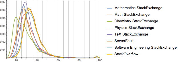
Now this is a bit cluttered, but we can see three distinct groups. Let’s isolate them (all with Mathematica as comparison). For each we’ll look at the weighted and unweighted forms:
The first is the chemistry exchange. It skews *very* young.
SmoothHistogram[
  Join[
    userAgeData /@
      <|

    "Mathematica StackExchange" -> mseUsers,
        "Chemistry StackExchange" -> chemUsers
        |>,
    userAgeData[#, Identity] & /@
      <|

    "Weighted Mathematica StackExchange" -> mseUsers,
        "Weighted Chemistry StackExchange" -> chemUsers
        |>
    ],
  PlotRange -> { {10, 100}, All},
  GridLines -> {Range[10, 100, 5], None},
  PlotStyle -> {Automatic, Automatic, Dashed, Dashed},
  PlotLabel -> "Mathematica and Chemistry"
  ]

(*Out:*)
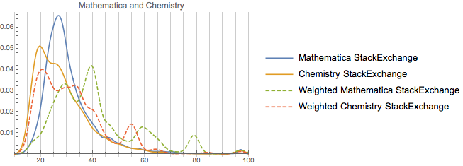
It looks to be as if it’s mostly undergrads, with a slight bump of grad students. But if you look at the weighted version, rep tends to skew towards older (professor-aged) users. All-in-all that’s probably a good thing.
Our second cohort is math, physics, and TeX. Unfortunately having all of those at one is too messy, so we’ll do a collection of stacked plots:This group
SmoothHistogram[
     Join[
       userAgeData /@
         <|

       "Mathematica StackExchange" -> mseUsers,
           #
           |>,
       userAgeData[#, Identity] & /@
         <|

       "Weighted Mathematica StackExchange" -> mseUsers,
           "Weighted " <> #[[1]] -> #[[2]]
           |>
       ],
     PlotRange -> { {10, 100}, All},
     GridLines -> {Range[10, 100, 5], None},
     PlotStyle -> {Automatic, Automatic, Dashed, Dashed},
     PlotLabel -> "Mathematica and " <> StringSplit[#[[1]]][[1]],
     ImageSize -> 365
     ] & /@ {
     "Math StackExchange" -> mathUsers,
     "Physics StackExchange" -> physUsers,
     "TeX StackExchange" -> texUsers
     } // Column

(*Out:*)
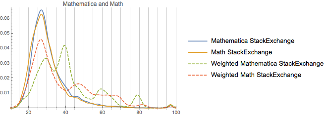
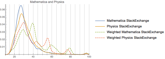
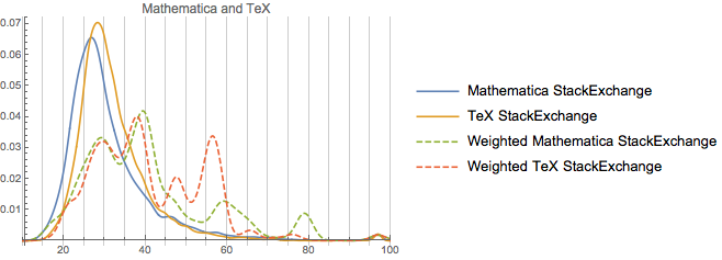
So we can note from this that these are in fact very similar communities age-wise (and there’s probably a good deal of user overlap, too). As far as rep-distribution goes, TeX seems to be a merger of physics and Mathematica. And the much strong peaking away from the unweighted distribution in the TeX and Mathematica communities does provide some confirmation for the specificity argument. Both are pretty specific sites, relative to, say, math or physics. And TeX itself is not a small community. It’s got ~115k users, which, while a third of the size of math, is still a bit larger than physics and ~3 or so times the size of the Mathematica community.
One final cohort to look at is ServerFault, Software Engineering, and StackOverflow:
SmoothHistogram[
     Join[
       userAgeData /@
         <|

       "Mathematica StackExchange" -> mseUsers,
           #
           |>,
       userAgeData[#, Identity] & /@
         <|

       "Weighted Mathematica StackExchange" -> mseUsers,
           "Weighted " <> #[[1]] -> #[[2]]
           |>
       ],
     PlotRange -> { {10, 100}, All},
     GridLines -> {Range[10, 100, 5], None},
     PlotStyle -> {Automatic, Automatic, Dashed, Dashed},
     PlotLabel -> "Mathematica and " <> StringSplit[#[[1]]][[1]],
     ImageSize -> 365
     ] & /@ {
     "SoftwareEngineering StackExchange" -> sweUsers,
     "ServerFault" -> servUsers,
     "StackOverflow" -> soUsers
     } // Column

(*Out:*)
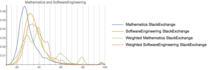
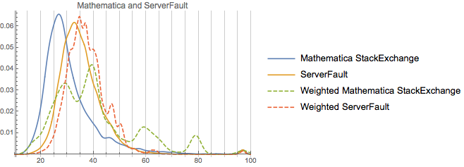
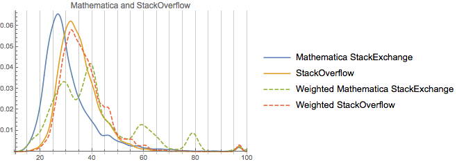
Note how similar these are. And note how none of them have as-strong peaks away from the unweighted distribution as Mathematica. Rep on Software Engineering is rather more correlated with age (perhaps an effect of academia, perhaps an effect of older more senior profession programmers or academic computer scientists), but not that much. Now, one thing to consider is how much these actual populations overlap. Let’s measure this against StackOverflow for all of the communities considered:
KeyValueMap[
    # ->
       Apply[Divide,
         Length /@
          {
            Intersection[
              Normal@soUsers[All, "account_id"],
              Normal@#2[All, "account_id"]
              ],
            #2
            }
         ] &,
    <|
      "Mathematica StackExchange" -> mseUsers,
      "Math StackExchange" -> mathUsers,
      "Chemistry StackExchange" -> chemUsers,
      "Physics StackExchange" -> physUsers,
      "TeX StackExchange" -> texUsers,
      "ServerFault" -> servUsers,
      "Software Engineering StackExchange" -> sweUsers
      |>
    ] // Association // Dataset

(*Out:*)
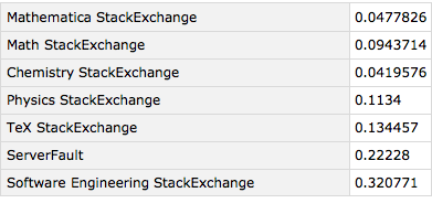
We can see that these two communities—ServerFault and SoftwareEngineering—share significantly more overlap with StackOverflow than do the rest, which makes their population overlap somewhat less surprising.
On the other hand they and StackOverflow are all skewed away from the other communities considered population wise. If I had to guess why that is, I’d say we’re seeing the difference between the professional world and academia. ServerFault, Software Engineering, and StackOverflow are likely more populated with professional programmers than are Mathematica, physics, math, and the others. Those communities are likely proportionately more student (mostly grad student, except for chemistry).
An unsurprising hypothesis, perhaps, but one that does seem to be born out by the data.